My Interaction:
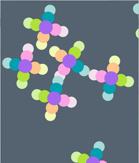
 With my interaction, I wanted to focus on objects moving independently of each other based on mouse movement. What I created in the end was different from the starting plan, but I am happy with the interaction I have create. I believe this interaction is successful because there are limitations to the movement of the objects which the user must try and overcome. This is a hard task to achieve, but portrays the idea of interaction and control well. As the user inputs the mouse movement into the conversation, the system produces a response which allows movement and rotation of the object in question, with limitations. Each object moves independently of each other, which allows for a wide range of movement. There is a specified number of objects on the screen (12) because with too many objects the interaction was lost and with too little amount of objects the interest is not present. I have used a wide range of colours to show the rotation of objects and to attract the users eye to the beautiful colours. I have enhanced the colour choices by using a contrasting tone of grey, illuminating the colours further. I have done the most I can with the time available, to create an interaction that users want to keep on playing. To me this interaction is successful as I can sit for a while interacting with the shapes trying to overcome the limitations of the system, and I just want to keep on playing!
 At the start of this project, we were asked three questions and to keep these in mind while creating our interactive mouse toys.

These questions were:
-How does control differ from interaction?
-What makes an interaction "fun"?
-How can interaction be used as an engaging form of control?

Well, now that it is the end of the project and the end of this course, I should be able to answer these questions through my journey of creating an interactive mouse toy.

How does control differ from interaction?
Interaction involves the user learning something about what they are doing. The need to learn not only means that they are interacting, but they are also continuing to use the application until they understand how every mechanism works. With control this does not occur. Control means the user understands what is happening because they are causing every action to occur. Interaction can be considered a conversation between the user and the application where there is an input by the user and a response to the input, given by the computer.


What makes an interaction "fun"?
Making an interaction fun is a hard thing to do as there are lots of different aspects that need to be considered. What I've learned through this project about making an interaction fun, is to incorporate a challenge that the user is working towards overcoming. For example in my interaction, there are limitations as to where the objects can move on the canvas. Users want to dominate interactions for a sense of completion, and by having a challenge that users can work towards overcoming, domination is hard to achieve, leaving the user feeling incomplete. Visual aesthetics are also an important part of making the interaction look "fun". Good visuals are important in attracting a user to an interaction, like judging a book by its cover.

How can interaction be used as an engaging form of control?
As these interactions are dependent upon the user's input, the interactions are controlled by whether the users have input or not. As interaction is like a conversation, the users input derives a response from the system, without the interaction of the user there would be no response and no action to occur. Although the user may not be able to control the response the system produces, the interaction by the user controls whether or no a response from the system is generated.
I have tested my interaction to see how a user would interaction with the movement of objects around the screen due to the limitations that were in place.


Video:

I noticed that the user became frustrated as they tried to overcome the limitations that were in place to limit the movement of individual objects. As the user was not able to successfully complete or "dominate" the interaction, they continued to try until they became frustrated. To me this shows good interaction as they kept trying and did not become bored or lose interest. Testing the interaction with someone else playing it was good to see, as it made me view the interaction I had created differently. Because I knew about the limitations in place and knew what to expect, I didn't realise how infatuated a user could become with completing the interaction until I saw someone else using it.
Time to investigate the canvas size and in relation the number of objects that will be situated on the page of the interaction. Originally I started using a canvas size of 500 x 500 pixels with 5 objects on the canvas.

#1
This size and number of objects was good as the canvas wasn't too crowded, but there still wasn't a great amount of room for movement.

#2
I then considered making the canvas a larger square and incrementing the number of objects. But the size that I increased the canvas too was too big and the whole screen wasn't viewable.

#3
I decided to move away from the square shape and morph into a rectangular portrait. This view was still quite hard to see the entirety of the screen and I didn't want to make it any smaller, otherwise the amount of interaction the user could do would be affected.

#4
I decided to test the landscape view as I had tested the portrait before. The size of this canvas as good as it allowed a good amount of interaction for 12 objects, where the user is able to move the objects around. If there were too many objects, then once the user moved one object, all the surrounding objects would be affected also. It is important that objects have a small amount of room surrounding them where there are not many objects, so as not to have a large amount of objects being affected by the mouse position. This is the canvas size and number of objects that I wish to use as it is a perfect ration for successful interaction to occur.


I have tested a range of background colours to make the composition more interesting. As I have changed my colour palette used in the objects, there is a limited tone of colours which are available to use that compliment the colours used in the objects. I have also removed the stroke from the objects as it makes the ellipses join together, whereas before the stroke feature converted the object to separate entities.

#1
This was the first colour I tested and quite liked. The background colour made the colour of the objects stand out.

#2
This colour was interesting to see, however I feel it is too dark and overbearing to use considering I wanted to use colour to portray and interaction that is meant to be fun and enjoyed.

#3
This was a nicer tone than the first one that I tested, but it was not quite right.

#4
I really like this colour and am going to use it in my interaction. The tone of this grey really makes the colour pallet used in the objects stand out. Also this tone is less overbearing than the previous grey tone that I had tested.

After investigating colour, I have chosen the combination of colours that I want to use in my objects. I have decided to use a mixture of bright and pastel colours, which become lighter moving outwards from the centre of the objects.


 Investigation of colour

Chic Rainbow - Alea Sebastian
These colours are nice and bright, therefore attracting the users eye. Potentially too bright to stare at for long periods of time.


Cheer Up Emo Kid - Electrikmonk
These colours are dimmer than the previous one. There is a good amount of contrasting to tell the different when rotating the object.


Ocean Five - DesignJunkee
Again there is good contrasting of colours.


Giant Goldfish - Manekineko
Although the colours are nice, the tones of blue and orange are too similar and will be hard to differentiate.


Mellon Ball Surprise - Skyblue2u
These are soft tones that have a really nice colour. However they may not be contrasting enough to effectively see colour changes.


Hymn For My Soul - Faded Jeans
Good contrasting of colours with a similar tone while only using blues and greens. 


Fresh Cut Day - Electrikmonk
Nice colours, but not contrasting enough to see a visual colour difference.


Maddening Caravan - Manekineko
For warmer colours there is mostly good contrast, but not quite.
Now that I have a form of interesting interaction, I want to focus on the design of the interaction. At the beginning of this project I thought I had created a shape that I was happy with because you could see a difference in the rotation of the object. Now I am not so happy with this because it is so simple and could be more interesting and visually appealing.

The current object:
At the moment, there are five separate objects on the screen, however this might change depending on the design of the new shape. The colours that I have used have always been temporary, hence the hideous colour choices. I have begun an investigation into possible colours and will continue to test and evaluate colours once the new shape has been designed.

The new object:

 The new object I have chosen to pursue is made up of 9 ellipses overlapping each other. There is a central point which must be included to provide accurate rotation. However there is a lot more depth to these objects. Once I involve colour and alter the stroke, the shape will be much more complex than previously.

I am investigating potential shapes that I could use in the design of my objects.

Modification #1:
I have added some more lines and ellipses to the shape to make it look more interesting. This was the first modification I found and it makes it harder to focus on just one of the objects.

Modification #2:
This is a rectangular formation that has been constructed with mutliple rectangles to create a unique deisgn where rotation is still able to be seen. I believe that this formation of object shapes could be quite effective depending on the colour added and any other features.

I've realised that to get a nice, smooth rotation occurring, there needs to be a central point to the object shape.

Modification #3:
 I really like the overlapping of ellipses. By incorporating  a viable colour palette, a cool effect could be created whilst taking into account the stroke colour.

Render:


Photography:

Relating back to my precedent images at the beginning of the project as I began to investigate an aspect of pattern, this is what I have created. New forms made due to slight changes. Through creating iterations I have designed three digital models in 3ds Max, and had one 3D printed. It is this model which best represents my idea of new forms being created due to slight changes in growth.
Hi-Res Render


With this image I wanted to envelope my model in the contextual environment, without the scene distracting from the focus on the model. The pieces of plant in the environment that are in focus in a way contain and envelope the model. However, the rest of the plant and environment which aren't enveloping the plant are less focused. Resulting in a good amount of focus on the model and environment. This contextual image portrays the exact message I wished to convey with my model becoming a part of the environment, as it grows. Not only is the model nestled amongst the plant, it has also been angled so that it sits "growing" in the same direction as the arms of the plant. The clarity of my model is really good also because there is contrasting between the internal structural growth and the surrounding area of growth.
I have created my final render in 3ds Max. To get to this point involved a lot of testing and trialing with composition and lighting. I have finally decided upon the composition of my three models, which are then further displayed with lighting.


I have chosen this composition as it best demonstrates the aspect of pattern that I was investigating. I was investigating the growth of a pattern due to slight changes being made. With my composition, I have ordered my three models so that when it is looked at, the hero model will be seen first, as it is the most important as the hero model was chosen to be 3D printed. I made the hero model the largest on the screen, and on the left so that it will naturally be the first model seen due to the fact that in English we read from left to right. The two other models have been placed on the right, after the hero model. These are different sized due to their importance, as the second model was my back up model to be 3D printed. The last model is the smallest and is also placed the furthest to the right. Not only is the composition placed as so for ease of view, placing importance on the hero model, but also represents the growth it took to reach this model. As I started this project from a simple idea, with my precedence, many larger ideas took place. Through making iterations of models and forming a tree of iterative models, a hero model was reached. With each iteration that occurred, changes were made affecting the model. Through this process of creating changes and further developing each iteration, the final model looked very different from the model that I started with. 

I have used lighting to enhance the look of my models and also creating shadows. As the lighting has been positioned in a way that makes the models look attached to their shadows, it extends each models form. As some of the detail of each model can be seen in the shadows, growth is still occurring as the model is seen in a different "light". The shadows provide potential for more growth because movement of light creates morphed shadows around an object. Although in my final render there is no movement of light, the angle of the current shadows suggests that the light source will continue to move, altering the current shadow around each model. This reiterates my idea of growth due to slight changes, as the displacement of the light source in my render will create shadows which have morphed or "grown".
Photo Shoot!

I have taken a range of images of my model, both in context and in the photo graphics studio.

In the studio:
When I was taking photos in the studio I found that because the model was symmetrical there was not a lot of variation. I took as many photos as I could and tried to get a good variation, but it was hard with a plain background and only lighting to work with. I felt that this did not show the message I wanted to convey, or show the growth of a pattern in any way. I did get some good product shots which showed nice images of my model as a whole. It was also a good opportunity to take some close up shots using the macro function, which allowed clarity for viewing small details. In the pictures I have included below from the photo graphics studio are the images which show off my model the best, in different ways.

#1
This is a product shot which shows off my model as a whole. Because of the symmetry, you are able to see the model as a whole, even the part that is block, because you are able to see all other aspects. Product shots are good to see what models look like as a whole, however, it is hard to focus on a particular detail. Therefore it is harder to convey a message as is is hard to focus on only one detail or aspect of the model, so I then took some close up images.

#2
 Here I have taken a photo of my model closer up, focusing on the twisting objects and the way that they curve. I tried to exclude the base from being included in the image, so as not to distract from conveying the message of growth. Although there is room for more detail to be included I do like how this image focuses on the growth aspect only, and not where the growth originates from.

#3
This is closer again and taken from a different angle. This image focuses on the internal structure of the growth and the encapsulating area around it. The message that is being portray in this image which compliments my idea, is growth extraction. An object growing out of a structure.

Contextual:
I wanted to do a photo shoot that involved my model in context. I tried to create a photo shoot that involved growth and tried to incorporate my model into the environment. I found and area that had twigs and branches that I could use. I begun to take photos and trialled lots of different areas and settings until I found a small branch that was beginning to coil that I could prop my model on. The direction that the branches were coiling on moved in the same direction as the way pieces of my model coiled. This was perfect as it showed off the growth of my model, as well as merging my model into the scene without the environment becoming overbearing and losing my model.

#1
The way the branch coils and follows the direction of my model is perfect for merging the two objects together and tying my idea into the environment. The focus is still on my model as it takes up the majority of the scene, while still allowing a small amount of the environmental detail to be seen.

#2
This model focuses on the internal structure being encapsulated by the points surrounding. The detail of the photography is not as good upon the model, however the rest of the photo shows a good amount of detail. Unfortunately this image is not as clear as the others, so I will not use this photo even though I like the composition.

#3
This model was photographed in a hole in a tree. The message I was trying to convey with this image was growing outwards from a fixed point. When I was taking this photo I didn't think the idea of taking the image in a tree would work very well, but the result turned out really well.

#4
The coiling of the branch follows the direction of my model really well, involving the model in the environment. The composition of this one is nice, because it incorporates more of the environment.

#5
The focus in this image is my model as the environment is not as distracting and overwhelming as the other images. The coil still manages to wrap around my model which is the key aspect that I want to include as it fully incorporates my model into the scene.

I am now creating my final render with the final composition and perfecting the lighting that best enhances the dynamics of my three models. As the aspect of pattern that I investigated was the growth of a pattern due to slight changes, I am trying to focus on changing the lighting with the growth of my three models. As I have positioned my models with the final model which was printed at the top of the "tree", my composition has represented the growth with changes that was undertaken to arise to my final model.

#1


#2 

#3

#4

#5

#6

#7
With this project, my initial idea was large and heavy. I originally wanted this interaction to follow a life cycle of new objects being created, movement occurring and under certain conditions destruction of objects to occur. To continue the interaction, I had though there should be a way to create new objects, creating a new life cycle. This idea that I had and was working towards was very heavy and laden with different aspects and ideas. I've realised that there is still too much control that is given to the user in this instance by creating an interaction with a life cycle. As the events in the life cycle are controlled by the actions of the user, there is not enough interaction occurring.

At this point I have made an interaction which through testing with people seems to retain interest due to the both the freedom of movement, but also the limitations the users seem to want to overcome. I will continue to do more testing of my interaction to see how users respond and whether they act in a controlled or interactive way. This will be the true test.
I got my model back! Now its time to go through the stages of cleaning the model. When I got my model back it didn't resemble anything like what I had created because of the resin surrounding the form while it dried. The resin was a layer created to help the form keep its shape and support it through the drying and hardening phase of the printing. This meant that I had to clean the model to remove the resin. This was done by chipping away at the resin which would turn into a crumbling mess. A solution of Sodium Hydroxide solution was then used to remove the remainder of the small pieces of the resin and help to improve the transparency of the model.

The cleaning process:


After Sodium Hydroxide Solution:

Powered by Blogger.