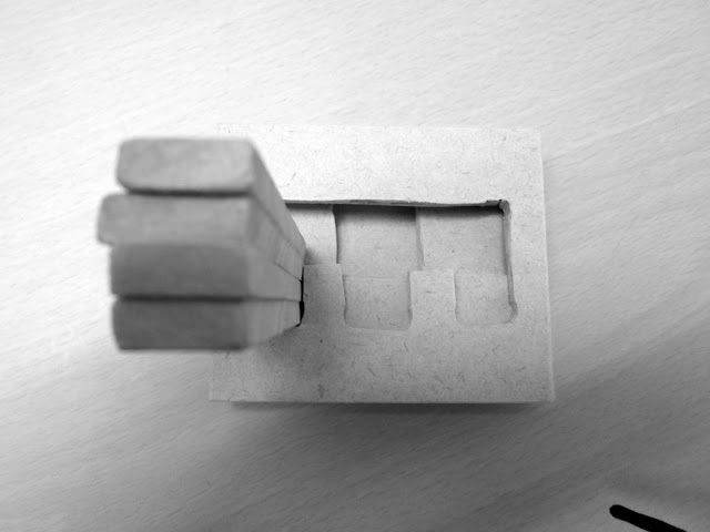
I have created my final storyboard but drawing each frame on a square of MDF wood. I then attached all frames to a sheet of MDF. I decided to create my storyboard this way as it relates to the material I am using within my stop motion. It also creates unity between the planning process and the developing stop motion to the final video.

I had to take pictures of my storyboard for now, but will try and scan tomorrow at design school using a larger scanner.


Does Art Nouveau have a place in present day society?

Art Nouveau is a style that developed from a combination of foreign materials and curvilinear, organic forms. Its popularity came to a peak between 1895 and 1910, (Willette, 2010), where exotic pieces were a sign of riches and high social status. 

Art Nouveau was based upon the previous styles of design that incorporated curvilinear aspects, much like the French Rococo style. As new styles build upon ideas and materials used previously, older styles are very important in today’s society as a reference to the development of design. According to German poet and artist “Everything has been thought of before, the problem is to think of it again,” (as cited  in Cassady, 2011). Art Nouveau has influenced more recent styles in different ways such as the exoticism and use of historical elements of Art Deco and the permanent illusion of Modernism. 

Designed pieces of the Art Nouveau style are said to incorporate aesthetics and ergonomics. The theory was that anything designed in this style was to be both used and admired because it was designed equally for how it looked and was operated. . “I see ornament in architecture as having a dual function. On the one hand it offers support to the construction and draws attention to the means it employs; on the other...it brings life into a uniformly illuminated space by the interplay of light and shade,” (Van de Velde, 1902). Because Art Nouveau is a more recent style of western society, there are many originals around which people have the opportunity to adopt.

Looking at how well pieces were made to be used, Art Nouveau originals are still being used today. There is not only a place to originals in today’s society; there is also room for new styles to be created which draws influence from this style. The use of a variety of foreign materials meant the style was versatile and could be used in conjunction with other styles popular at the same time. This also applies to the present day where many people choose to adopt many design styles in an attempt to portray a message to society.

Bibliography:
·         Cassady, D.C. (2011). Writers’ Dock: Originality Is Dead. Retrieved from http://writersdock.com/2011/11/10/originality-is-dead/  

·         Van de Velde, H. (1902). Kunstgewerbliche Laienpredigten. Retrieved from http://www.bc.edu/bc_org/avp/cas/fnart/symbolist/vandevelde.html

·         Willette, J. S. (2010). Defining Art Nouveau. Retrieved from http://www.arthistoryunstuffed.com/defining-art-nouveau/
I have created a draft of my storyboard as I was puzzled with how to go about starting it.


I have added some audio in Adobe Premiere Pro to test how to do it, but also see the effect it gives the video. I found the sounds using freesound.org and and using the sounds of water dropping and wind. I also used an 8bit sound imitation to represent the game people of all ages know and love.


I have been working on my stop motion and incorporating the idea of using Tetris to build the slum house.


After reading Garman’s intentions on how he wants to go about representing the Mighty K’s Challenge I have a clear idea of his thoughts. The story line of walking a far distance to get water, a basic survival necessity makes the idea of the Mighty K’s challenge very realistic. Instead of just representing the Mighty K’s distance, Garman included in his idea the fact that many people have to go a very far distance to get something essential to their survival.


Looking at Garman’s storyboard I can understand what is going on from reading the summary of intentions. However more work is needed and attention to detail is really important. It is said that a storyboard should be detailed enough so that someone else could create the stop motion from seeing the storyboard. But I feel the storyboard is not unified as there is quite a lot of text and not enough attention to the detail within each frame. If this was more detailed and cleaner to create a unified storyboard, then I think it would be easier for Garman to create his stop motion as the frames are broken down into what he needs to do.


Watching the developmental stages of the stop motion being filmed was interesting to see, especially starting in Photoshop and changing to use card and paper. I like the idea very much and the filming of the stop motion so far seems very good. However there is one part that doesn’t quite fit with the rest of the video. The use of the “poof” clouds is feeling a bit random and also makes it slightly confusing when the same “poof” clouds come onto the screen as storm clouds which start to rain. A better way is needed to incorporate the change of scene; this could be a simple transition to different paper through the character walking.


The overall development of the stop motion is going very well and the use of card looks aesthetically pleasing. I think there are just a few things to fine tune before carrying on such as the storyboards and the clouds, but the progress is going well and is a good way to represent the Caritas Challenge.
After conducting some more research into how I could push my idea further, I have decided that I want to incorporating the Tetris idea of using blocks dropping into particular places to create a structure. This idea came to me when searching Vimeo for inspiration of stop motions.


http://vimeo.com/13071861


I really like the way there are other things happening in the background, but not so much that it takes away from the actual stop motion focus on the Tetris happening. I also like how there is a cause and effect action occurring between the Tetris game box and the rest of the screen. Depending on whether the new Tetris piece is on the left or right side of the box, if there is action occurring in the background, it happens on the same side. This particular detail was really fascinating as it was very subtle to pick up on.
I have made another model to test another way of constructing the piece. I used the 3mm MDF wood and used a craft knife to cut through it. This proved to be a better method because I have more control over the knife compared to the jig saw. This meant that the lines I was cutting were much straighter as I could use a ruler for guidance. Also if I did go off course slightly I was able to cut into the wood and realign the cut which proved helpful in a few instances.

I also tried to arrange the pieces in a way that was not so "boxy" and spanned them out. This proved to look like a very interesting interface.


An updated version of my storyboard:

I did a test stop motion using nail polish bottles, a very standard object that would be easy enough to manipulate between each frame.

10fps:


20fps:


Today in studio we talked about refining the interface of our models once we have the motion active. As I was talking to the tutor she mentioned that my model so far is very heavy and block like. This is because the motion happens within the block of wood. The advice I was given was to look at interface design to determine a way to design the outside to make it visual lighter and not in such a block format.


I have been looking at objects around the house to examine the detailing of the interface design and the hints given away to suggest the movement they propose. I found some great examples that show different types of movement, but it was also interesting to see objects with a similar function but a completely different interface.

 
I attempted a small investigation into the staining of wood with some offcuts of MDF I had while crafting my model. I tried to think absract in terms of what I could use to stain my wood to give me some more options. I tested a clear stain on the MDF, but all this did was enhance the colour of the MDF, which is not very nice to look at anyway. I used a shoe polish to stain the wood, one a light coat and one a heavy coat to see the range the colour had. This worked very well as it was not painting over the properties of the wood. 


I have continued to work with my model and make some progress on its development. Yesterday was quite a big day, I started to make a wood version of the model and I was very nervous about how it was going to work.

To make the first version of the wooden model I used a combination of tools to produce the piece. I drilled holes in the corners and used a jig saw to cut the connecting lines. However I found it very hard to keep the jig saw straight. I also tried using a chisel to cut through the wood. This created a straight line, but it also damaged the wood as the force broke apart the layers. I then had to sand all the edges that were cut to create a nicer visual and texture. I also used a normal saw to cut the larger lines that could be cut directly. I was quite tired by the end of this as it took a really long time to cut everything and I'm not exactly the strongest but I tried my best at testing a method. A test which I found to be successful because it produced my model out of the real material. A good starting place.


Model:


I decided to experiment with some liquid latex to create my own form of rubber. By doing this I can use the size the best fits with my model and although I have to build it up. I don't have to rely on other manufactured forms of rubber that may come in set dimensions that don't work with my model.


I have created a cardboard model that shows how I am going to lock in the back of the joint. By having the card at different heights, a simple shift cannot occur as the piece is locked into its surroundings. There has to be a lift of the piece to get it out of the lock.


After some presenting and critiquing in class today, I decided to take the advice I was given and apply it to my logo to see how it would create a difference.

Original: 


Development 1:


Development 2:
 

Initial Storyboard showing the plan of action:


Caritas is a charity that has created the event, The Caritas Challenge to support people all over the world who struggle to survive. The aim of this challenge is to fundraise for these people but also to spread awareness of the harsh lives these people lead in comparison to others.
 
With this 24 hour task, a challenge must be completed that is an aspect of life these people struggle through each and every day. These tasks are difficult and are advertised as working together with friends to show solidarity and support each other through the challenges.

With my stop motion I am going to create a 40-60 second clip, made up of still images that represent the Slum Challenge. I want to create a video that brings forth empathy in the viewer and encourages them to take up the challenge, to support caritas in supporting these people.

I wish to create my stop motion out of Lego and use a character that the viewers can relate to. During the video I want to show the character building a house that keeps getting destroyed by the elements, but he keeps trying to rebuild it. I then want to have a helping hand come through that represents Caritas, and build a strong house that can stand against the elements. This will all be done with taking still pictures. This shows how offer a helping hand to those in need, and also advertises the Slum Challenge as one of the challenges you can undertake.


Powered by Blogger.