I have been working away at completing the creative page. I have changed the background to a more elegant white background that has some watercolour paint down the left side. This background is much more appropriate as you can see everything on the page clearly, unlike before. With the colour on the left hand corner, there is still a bit of magic within the site.


I have most of my information and am now just working on the position and design of the snippets of information. I still need to decide on colour for elements on the page and whether I want to add any other colours than just black text.

Below is a screenshot of my creative page. Because the background is fixed in place when I screen shot it, it appears multiple times. The background does not actually appear like this.

I have started working on the creative page and inserted a background image. However I am not sure if I will continue to use this image because the colour is a little bit too much. I have also creative divs that will contain snippets of text further on in the development. These divs are coloured to see the positioning and spacing on the page.


I have been working on my professional styled paged and have been testing colour schemes. I have also been using the positioning feature of fixed position for some objects. As the brief states that we are directing this bio page towards potential employers I have used fixed position to ensure that my name and picture of my face are constantly seen. This reinforces who's bio page they are reading about.

I have also been using blue/grey tones for the font on my page. It is easy to read against the dark background I am using. I find that the contrasting of white font against a dark background can cause some strain on the eyes, and have determined that a middle range tone is best for reading purposes.

With future development I feel as though I need to have something on my page to break the text apart. I am considering using coloured div sections to break apart the text. Because in reality each sentence of text is separate and do not relate. Therefore why should they not be broken up into sections with the use of design elements?

I have changed my mind about the layout for the professional website. As the brief was updated and the words and image allowances were decreased I have tactfully changed the layout of the professional website. As I am only only to include one jpeg image, I felt that it would be good to include a picture of my face. Also as the word limit is only 100 words I wanted to make sure the image stood out against the text.

I began creating my website and stumbled into fixed position of objects. To reinforce who the webpage is about I wanted to include the feature of fixed positioning so that whoever was viewing the website would be able to see my name and face. This way they can associate the information they are reading with a name and face.


As you can see the scroll bar is still in the picture and indicates that there is more information below. As the user scrolls down, Sharnia King, Designer and Image all scroll down also.
I have been using Adobe Kuler to create some colour schemes that go well together. I have done this for both the professional and personal websites using colours that I like.

Professional:


Personal:


The information I have currently on the webpage are some ideas for information tiles.
These include:
  • Who
  • When
  • Where
  • What
  • Why
  • How
This goes well with keeping in the theme of short information tiles.
I have sketched some layout ideas for my bio page. I have included a range of ideas that would be applicable to both the personal and the profession sense as it will depend on the css style as to whether it will look personal or professional.

I particularly like the look of Layout Two with the idea of having information tiles. This is be very easy to read as I have found on websites with large amounts of text, despite the style of it, it is very hard to read and I often give up. However with using tiles of information snippets are much easier to read. I am going to attempt to create and implement this layout in two different styles to make a personal and professional version of my bio page.


Looking at website sketching and this website gave me some great ideas of how to sketch layout designs for a web page. It also made me very aware of how much detail should be added to make it as comprehensive as it can be.

http://webdesignledger.com/inspiration/18-great-examples-of-sketched-ui-wireframes-and-mockups


By developing sketches ot this level of detail it makes the plan of action more organised. This way I will know what has to be done and how much I still have to do. It's a way of breaking down the bio page into parts and completing them one by one.
I have found a website that details a wide range of bio pages of people. The range is very diverse and I have found it very interesting to look at the different design. The websites are not directly applicable to our brief in the sense that these are not following the personal or professional boundaries. There are a mixture of personal and professional styles that seem to work in advertising for the individual.

http://mashable.com/2010/09/15/creative-blogger-bio-pages/#_


This has made me realise that although we have to create a website that has a personal and professional css stylesheet, they can both still be fun. As I want to advertise myself as a designer, I can link in the professional and colourful side of design to make it more interesting. This way there will be more interest in my site and gather more follows.
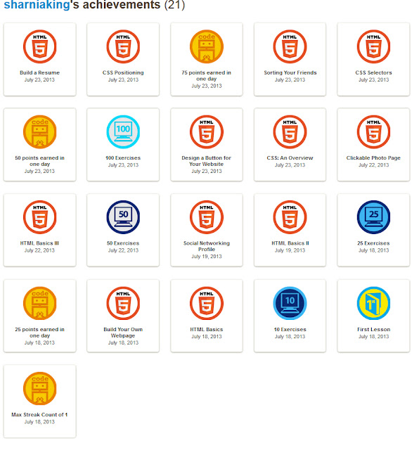
I have completed the web fundamentals on Code Academy.

By doing this I have further developed my knowledge of cascading style sheets and learned a lot about how to format them. The most useful tools that I learned were about the margins, padding and positions as well as float. I had experimented with these properties before, but did not know what they meant. However I fully understand how to use and manipulate these properties after completing the exercise.
Class exercise in creating a HTML page and linking it with a CSS page to format it.


With this site we wrote some information on the HTML page and then used a Cascading Style Sheet to format and design the page. Although it is not very pleasing from a design perspective, it is very colourful with different sized writing. This was a good experiment to practice what we had already learned but also incorporate the new information we had listened to in the lynda.com tutorial previously about CSS. 

I had one small problem that taught me to double check my code. My CSS page didn't link properly and I didn't realise until I went to format a paragraph and it didn't work properly. As it turns out there was a spelling mistake in my linking code so it didn't link properly. Once the spelling mistake was fixed it worked correctly. This has reminded me to check my code after writing it, even if I know what I am writing, because mistakes can happen easily when typing.
There are a few Firefox add-ons mentioned in the lecture on Friday. I have now downloaded them as they will be useful for designing and formatting, particularly when finding a webpage that is good inspiration.

Add-Ons:

MeasureIt - Used to measure elements and proportions on web pages.
ColorZilla - Provides RGB values of colours on screen, selected with the use of an eyedropper tool.

Firebug - Allows you to view and edit source code of a webpage, the changes are only temporary.

It is very helpful that Mozilla Firefox have these add-ons which we are able to use. Very handy to have these tools at our fingertips on the internet browser tool bar.
A few notes about the lynda.com tutorial we watched in class regarding the introduction to Cascading Style Sheets (CSS)


  • CSS gives control to the designer over formatting the html pages.
  • By applying styles to the document, there are more design options.
  • The styles can still be changed with the html page.
  • Consistency can be obtain by using CSS pages.
  • Can make large changes by applying a selector to a whole div. 
  • Can make smaller changes in the html page by using span.
  • Selectors are indicative of the area being formatted. The selector is followed by decorators which contain the properties of the formatting..foo{
    }
    applies to <h1 class=”foo”>
  • # acts as an id, so can change a specific area of the html <p id=”p1”>
  • White space is ignored in both HTML and CSS.

Three sections of Code Academy Web Fundamentals have been completed.
It was really interesting using Code Academy for the first time to learn HTML. I have used the coding language HTML before in other classes such as INFO101, and other classes such as Digital Technology at high school. By using this program to further develop my knowledge of HTML and also use it as a refresher course. When it came to learning about tables I learned a few new techniques of using tables and colspan to create nice tables that are displayed in an easy manner to read. The rest I had already learned in INFO101 last trimester. I am looking forward to further developing my HTML skills and creating interesting websites and involving Cascading Style Sheets (CSS).

Website One:  http://www.microsoft.com/en-nz/default.aspx
This is a minimalistic website that contains some intriguing and interactive features. The website is sectioned into layers, one after the other that features a different topic as well as a different layout and background. The slideshow at the top of the page is useful for advertising hot topics within Microsoft at present; however the background could extend to the edge of the screen. Also the feature that the user is able to click on each slide within the slide show if they wanted to have another look is a very important feature to have when using slideshow as advertising. The Microsoft logo needs to be bigger so that it is more dominant. Although there are other features around the page that indicate it is a Microsoft website, there needs to be some obvious ownership to the header. The footer is also very long and could be condensed somewhat. However having so much information in the footer is good because it acts as a point of reference where users can find more information in an easier and faster way. The colours used are very good because only several bright colours have been used. This makes it interesting to look at without too much colour to make it confusing. Also there is emphasis on blue which is the theme colour of Microsoft, which further addresses the ownership issue. Overall the website is very fit for the purpose of advertising but also producing information that is relative to both Microsoft and the user. Although there are a few design aspects that could be tweaked, it is a very effective website.


This website has a very clean feel to it as it simple and uncluttered. The images have been spread about the page in a way that is interesting to the eye but also makes the eye flow around the page to each point. This is due to good placement of the images. There is a small notepad style box that contains a message from the author; I feel this particular box could be placed better. Considering it is the only written information on the page that contains substance, this should be placed nearer to the top left, not the bottom right, as this is the last area the user looks at. When clicking on tabs within the menu the navigation bar expands to give more detailed information and also more links within the section. This is a good took to use because it widens the options the user is able to undertake. The webpage has been centralized and could be wider. The one problem with the navigation bar on the left hand side is that it makes the web page heavier on one side.
When entering the site it is very interactive and also looks very intriguing. The three different areas have a hover feature that changes the way the box looks and makes you want to click on it. When going further into the website by clicking on each of the different sections, new pages appear that have different themes but appear to have the same or similar layout. Each new page is centralized but this allows the background to be seen and have an effect. The backgrounds on two of the sections are patterned and this creates a sense of fun associated with the product. The headers have a really good size proportion compared to the rest of the page, as do the titles and logos within the headers. The text properties are good because of the amount of spacing used means the eye can focus. Also the use of bold text draws the eye to written information that is particularly important. This website has used text properties really well as the website is very easy to read.
Website Four: http://cargocollective.com/ricardolandim
This website is very image based which must contain a good layout. The layout used on this website is ok, however it does not guide the eye around the page, just horizontally across the screen. The fact the the width of the images are the same in each the vertical rows so that they all match together. If they didn’t the flow across the page would be hard to maintain. The title displaying the name of the person is very hard to read as it is split between horizontal and vertical directions. In my opinion it must be one or the other, especially when there is so much else on the page to look at. This is negative for the owner because his name will not be remembered once the user has left the website. The hover feature changes the colour of the polaroid like boxing from white to grey. A very useful tool when the background is also white because the mouse is hard to see. Considering that the website is made up of pictures, it is effective in being able to display all of them. 

This website is very interactive with the mouse. When moving the mouse in any direction on the screen, the circles also move in different ways separate from one another. This is not very functional though as I found out when I hovered over on that a link came up, but when I moved away, the link disappeared. This happened with every coloured circle, and every time the link would disappear. This is very creative in terms of giving the site a lot of interaction, but the execution is not as practical. There is sound affects as well which can get irritating when going over multiple coloured circles. The screen width is across the whole page throughout the entire website, remaining consistent. The background is an off white colour which is nice on the eyes, as it is not as bright but remains very clean looking while contrasting the circular rings. Although the website is actually French, the layout of the text seems very orderly and easy to read due to the alignment of each line. Overall this website is aesthetically pleasing but a few practical things could be worked on to increase the user friendliness of the website.

Powered by Blogger.